We live in a world full of information. The quantity of datadatadata that surround us is enormous. The eye‑catching ways of presenting data enable to absorb them more easily. If you combine functionality with the aesthetics of presenting data, they will be more understandable for an audience. One of the methods of the graphical presentation of data are charts.
A chartchartchart is a graphical format for presenting datadatadata volatility. Charts are often used to make it easier to understand large quantities of data and the relationship between different series of data. A chart can present tabulated numerical data, functions and other more complicated structures.
In order to create a chart in Excel, you must enter numerical data which will be represented in the form of a chart. After selecting the data, you can quickly create a chart by selecting the type of chart you want on the Insert tab, in the Charts group. Excel supports a variety of chart types. Adjust the choice of a chart to the type of data you want to present. You can create a combination chart by using more than one chart type in your chart.
R1e9YmadswCNv
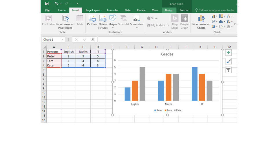
Zrzut ekranu przedstawia kartę Insert na wstążce programu MS Excel. Elementy zostały pogrupowane i stanowią osobne sekcje na wstążce. Od lewej strony widoczne są kolejno grupy: Tables, Illustrations, Add-ins (możliwość pobrania dodatków), Charts (wykresy, mapy i wykresy przestawne), Tours (przewodniki), Sparklines (wykresy przebiegu w czasie), Filters, Links, Text (np. pola tekstowe, nagłówki i stopki, WordArt), Symbols (równania i symbole).
The Insert tab
Source: GroMar, licencja: CC BY 3.0.
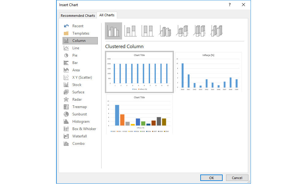
RrkClHIncNQBR
Zrzut ekranu przedstawia formatkę Insert Chart. Po lewej stronie znajduje się lista dostępnych typów wykresów. Od góry: Recent (tutaj znajdą się ostatnio używane) oraz Column (aktywne), Line, Pie, Bar, Area, X Y Scatter, Stock, Surface, Radar, Treemap, Sunburst, Histogram, Box & Whisker, Waterfall, Combo. Prawa część formatki, znacznie większa od lewej - tutaj znajdują się na górze w sposób schematyczny przedstawione typy wykresów kolumnowych. Aktywny jest Cluster Column. Poniżej znajdują się trzy przykłady wykresu odnoszącego się do przykładowych danych w arkuszu. Na Dole, po prawej stronie formatki znajdują się dwa przyciski OK i Cancel.
A data labeldata labeldata label that you can use to identify the details of a data point in a data seriesdata seriesdata series.
RmgaEgGvJ1s1g1
Pokaz slajdów - typy wykresów. Instrukcja obsługi z poziomu klawiatury: 1. Uruchomienie aplikacji - ENTER, 2. Na każdym ze slajdów czytany jest automatycznie tekst alternatywny po polsku, 3. Przy pierwszym uruchomieniu na pierwszym slajdzie, czytanie tekstu po angielsku - TAB, 4. Przejście między slajdami: do następnego slajdu - TAB, do poprzedniego slajdu - TAB + SHIFT, 5. Przejście do czytania napisu po angielsku - strzałka w górę + strzałka w dół (czyta tekst po angielsku widoczny na slajdzie).
Pokaz slajdów - typy wykresów. Instrukcja obsługi z poziomu klawiatury: 1. Uruchomienie aplikacji - ENTER, 2. Na każdym ze slajdów czytany jest automatycznie tekst alternatywny po polsku, 3. Przy pierwszym uruchomieniu na pierwszym slajdzie, czytanie tekstu po angielsku - TAB, 4. Przejście między slajdami: do następnego slajdu - TAB, do poprzedniego slajdu - TAB + SHIFT, 5. Przejście do czytania napisu po angielsku - strzałka w górę + strzałka w dół (czyta tekst po angielsku widoczny na slajdzie).
On the Internet, find the information about the number of lynx, wildcats, wolves, bears and bisons in Poland. Create a chartchartchart which in your opinion is the most appropriate for presenting these data. Format the chart: add the title and legendlegendlegend.
On the Internet, find the information about the area of the oceans on Earth. Create a chart which in your opinion is the most appropriate for presenting these datadatadata. Format the chart: add the title and legendlegendlegend.
On the Internet, find the information about the most popular foreign languages that are learnt in primary schools in Poland. Create a chartchartchart for the five most popular languages. Format the chart: add the title and legendlegendlegend.
The graphical presentation of numbers, trends and forecasts makes them more understandable for an audience.
Exercises
Exercise 1
R1TuO8cqEOupo
Wersja alternatywna ćwiczenia: The elements of a chart include: Możliwe odpowiedzi: 1. The chart area., 2. The axis area. , 3. The data points., 4. The horizontal (category) and vertical (value) axis., 5. The plot legend. , 6. The chart titles., 7. The axis titles.
Wersja alternatywna ćwiczenia: The elements of a chart include: Możliwe odpowiedzi: 1. The chart area., 2. The axis area. , 3. The data points., 4. The horizontal (category) and vertical (value) axis., 5. The plot legend. , 6. The chart titles., 7. The axis titles.
The elements of a chart include:
The chart area.
The axis area.
The data points.
The horizontal (category) and vertical (value) axis.
The plot legend.
The chart titles.
The axis titles.
zadanie
Source: GroMar, licencja: CC BY 3.0.
Exercise 2
Present the mean temperature in Gdańsk in the years 1981‑2010. Try to present the data by using three different charts. Decide which of them presents the information the best.
Month
Mean temperature [C°]
January
0,1
February
1,1
March
3
April
7
May
11,7
June
15,4
July
18,2
August
18,1
September
14,3
October
9,4
November
4,5
December
1,2
Exercise 3
What chart presents percentage data the best? Consider various situations. Explain your answer.
Exercise 4
R1S4VSGFr9HDb
Wersja alternatywna ćwiczenia: Indicate which pairs of expressions or words are translated correctly. Możliwe odpowiedzi: 1. wykres - chart, 2. dane - data, 3. seria danych - data series, 4. obszar wykresu - chart area, 5. tytuły wykresu - plot area, 6. obszar kreślenia - chart titles
Wersja alternatywna ćwiczenia: Indicate which pairs of expressions or words are translated correctly. Możliwe odpowiedzi: 1. wykres - chart, 2. dane - data, 3. seria danych - data series, 4. obszar wykresu - chart area, 5. tytuły wykresu - plot area, 6. obszar kreślenia - chart titles
Indicate which pairs of expressions or words are translated correctly.
wykres - chart
dane - data
seria danych - data series
obszar wykresu - chart area
tytuły wykresu - plot area
obszar kreślenia - chart titles
zadanie
Source: GroMar, licencja: CC BY 3.0.
RMbtOlGVtsgmu1
Interaktywna gra, polegająca na łączeniu wyrazów w pary w ciągu jednej minuty. Czas zaczyna upływać wraz z rozpoczęciem gry. Jeden ruch to odkrywanie najpierw jednej potem drugiej karty z wyrazem. Każdy wyraz jest odczytywany. Kolejny ruch to odkrywanie trzeciej i czwartej karty. W ten sposób odsłuchasz wszystkie wyrazy. Nawigacja z poziomu klawiatury za pomocą strzałek, odsłuchiwanie wyrazów enterem lub spacją. Znajdź wszystkie pary wyrazów.
Interaktywna gra, polegająca na łączeniu wyrazów w pary w ciągu jednej minuty. Czas zaczyna upływać wraz z rozpoczęciem gry. Jeden ruch to odkrywanie najpierw jednej potem drugiej karty z wyrazem. Każdy wyraz jest odczytywany. Kolejny ruch to odkrywanie trzeciej i czwartej karty. W ten sposób odsłuchasz wszystkie wyrazy. Nawigacja z poziomu klawiatury za pomocą strzałek, odsłuchiwanie wyrazów enterem lub spacją. Znajdź wszystkie pary wyrazów.
Match Polish terms with their English equivalents.
chart area
wykres
plot area
seria danych
chart
dane
data
data series
obszar kreślenia
obszar wykresu
Source: Zespół autorski Politechniki Łódzkiej, licencja: CC BY 3.0.