You will learn to interpret percentage diagrams: bar charts and pie charts, based on gathered information or information coming from various sources and to create such diagrams.
Learning effect
You interpret and create percentage diagrams: bar charts and pie charts, based on gathered information or information coming from various sources.
Prepare diagrams, cut out of newspapers, posters, leaflets, etc.
Revise information about diagrams you learnt during last lesson.
Open the applet and observe how the percentage diagramspercentage diagramspercentage diagrams – pie chartpie chartpie chart and bar chartbar chartbar chart – change, depending on data.
RrAhwn1UZyXFI1
Geogebra aplet - Diagram słupkowy i kołowy. Galeria z opisami alternatywnymi poniżej.
Geogebra aplet - Diagram słupkowy i kołowy. Galeria z opisami alternatywnymi poniżej.
Na rysunku przedstawiony jest diagram słupkowy i odpowiadający mu diagram kołowy ilustrujący odpowiedź na pytanie „ Jaki kolor najbardziej lubisz?” W diagramach wykorzystano kolory: niebieski, zielony, czerwony, żółty i fioletowy. Rysunek przedstawia sytuację, gdy każdy kolor wskazało po pięciu ankietowanych.
Source: GroMar, licencja: CC BY 3.0.
R12DHLiDU3SzO1
Na rysunku przedstawiony jest diagram słupkowy i odpowiadający mu diagram kołowy ilustrujący odpowiedź na pytanie „ Jaki kolor najbardziej lubisz?” Rysunek przedstawia sytuację, gdy niebieski wskazało osiem osób, zielony – cztery osoby, czerwony – siedem osób, żółty – trzy osoby, a kolor fioletowy dwie z ankietowanych osób.
Prepare poster out of four diagrams that you prepared earlier. The result has to be consistent and visually original. Under each diagram, write four questions about what it represents.
An extra task: Make a questionnaire about any subject among students of your class and create a percentage diagram presenting obtained results.
Remember:
We often present statistical datastatistical datastatistical data on various diagrams. Most common are bar charts and pie charts.
A diagram should be titled, described and have a clear scale.
Do the revision exercises.
Exercises
Exercise 1
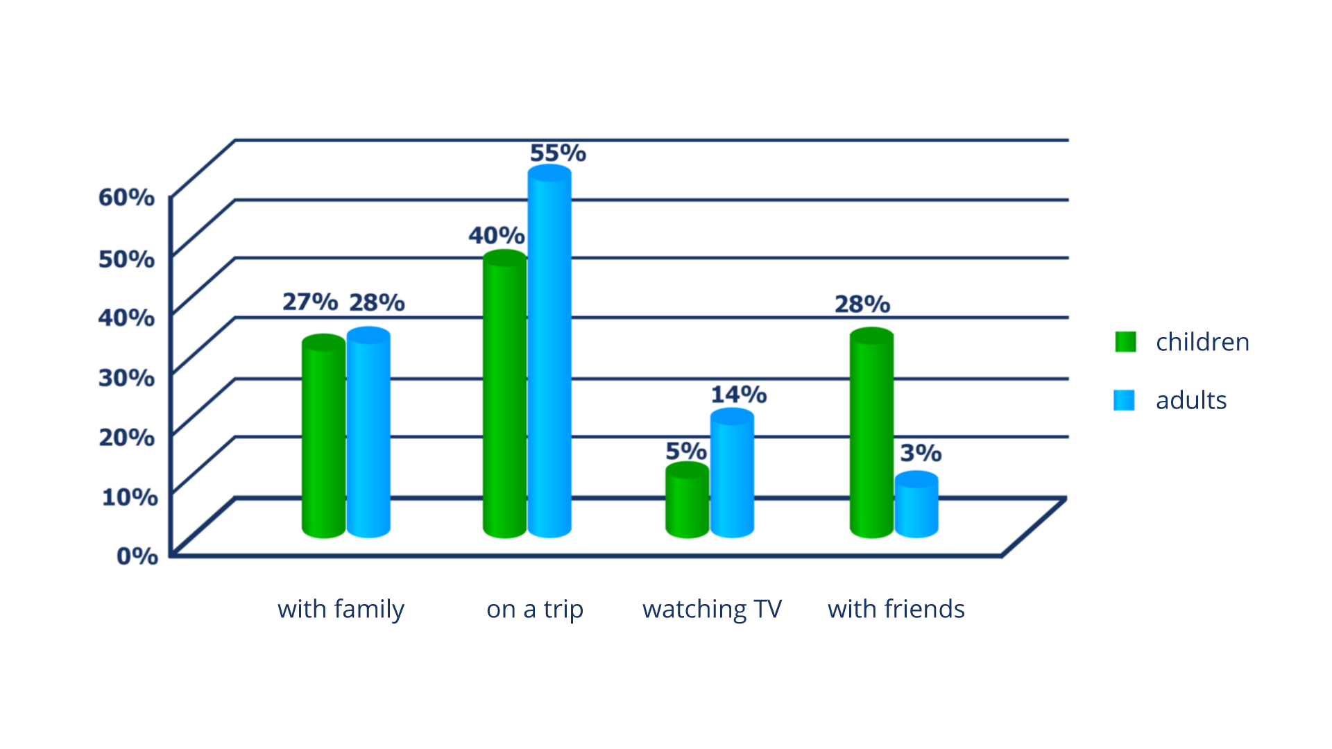
A survey was conducted among several dozen of families and results are presented in the form of percentage diagram. „How do you like to spend your free time the most?”
RZ8CGDK4tddHE1
Na rysunku przedstawiony jest diagram procentowy walcowy, na którym znajdują się informacje dotyczące dwóch badanych grup: children i adults. Odpowiedzi każdej z grup są zaznaczone innym kolorem. Na osi poziomej zaznaczono: with family, on a trip, watching TV, with friends. Na osi pionowej zaznaczono: 0%, 10%, 20%, 30%, 40%, 50%, 60%. Wykresy w punkcie with family narysowane są do wysokości 27% - children, 28% - adults. Wykresy w punkcie on a trip narysowane są do wysokości 40% - children, 55% - adults. Wykresy w punkcie watching TV narysowane są do wysokości 5% - children, 14% - adults. Wykresy w punkcie with friends narysowane są do wysokości 28% - children, 3% - adults.
Source: GroMar, licencja: CC BY 3.0.
RoEBtl6GewPpK
Wersja alternatywna ćwiczenia: Determine which sentences are true. Możliwe odpowiedzi: 1. Children prefer to spend free time with friends more than adults., 2. Children prefer to spend free time with family rather than watching TV., 3. Children prefer to spend free time watching TV rather than on trips.
Wersja alternatywna ćwiczenia: Determine which sentences are true. Możliwe odpowiedzi: 1. Children prefer to spend free time with friends more than adults., 2. Children prefer to spend free time with family rather than watching TV., 3. Children prefer to spend free time watching TV rather than on trips.
Determine which sentences are true.
Children prefer to spend free time with friends more than adults.
Children prefer to spend free time with family rather than watching TV.
Children prefer to spend free time watching TV rather than on trips.
Exercise 2
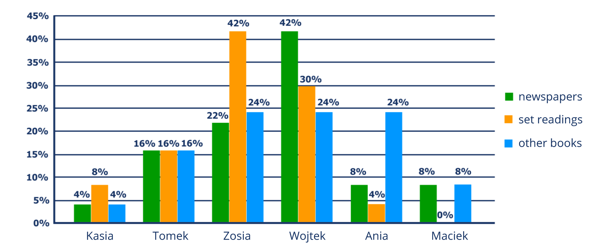
Marysia asked her friends what percent of their time they spend on reading newspapers and books. She asked everyone to fill in the diagram and obtain following results.
Rtkr6jKnbScvU1
Na rysunku przedstawiony jest diagram procentowy słupkowy, na którym znajdują się informacje dotyczące trzech badanych grup: newspapers, set readings, other books. Odpowiedzi każdej z grup są zaznaczone innym kolorem. Na osi poziomej zaznaczono: Kasia, Tomek, Zosia, Wojtek, Ania Maciek. Na osi pionowej zaznaczono: 0%, 5%, 10%, 15%, 20%, 25%, 30%, 35%, 40%, 45%. Wykresy w punkcie Kasia narysowane są do wysokości 4% - newspapers, 8% - set readings, 4% - other books. Wykresy w punkcie Tomek narysowane są do wysokości 16% - newspapers, 16% - set readings, 16% - other books. Wykresy w punkcie Zosia narysowane są do wysokości 22% - newspapers, 42% - set readings, 24% - other books. Wykresy w punkcie Wojtek narysowane są do wysokości 42% - newspapers, 30% - set readings, 24% - other books. Wykresy w punkcie Ania narysowane są do wysokości 8% - newspapers, 4% - set readings, 24% - other books. Wykresy w punkcie Kasia narysowane są do wysokości 8% - newspapers, 0% - set readings, 8% - other books.
Source: GroMar, licencja: CC BY 3.0.
Based on information from the diagram, answer the questions.
Who reads the most set readings?
Who reads newspapers most often?
What does Ania like to read the most?
How many set readings did Maciek read?
Exercise 3
Conduct a survey „How do you like to spend your free time?” among your family members. Present results in the form of percentage diagram. Describe the diagram in English.
Rx9osoHjnALpG
Exercise 4
Wersja alternatywna ćwiczenia: Indicate which pairs of expressions or words are translated correctly. Możliwe odpowiedzi: 1. diagramy procentowe - percentage diagrams, 2. dane statystyczne - statistical data, 3. wielkości przedstawione na diagramie - quantities presented on the diagram, 4. diagram słupkowy pionowy - vertical bar chart, 5. diagram walcowy - pie chart, 6. diagram kołowy - cylinder bar chart
Wersja alternatywna ćwiczenia: Indicate which pairs of expressions or words are translated correctly. Możliwe odpowiedzi: 1. diagramy procentowe - percentage diagrams, 2. dane statystyczne - statistical data, 3. wielkości przedstawione na diagramie - quantities presented on the diagram, 4. diagram słupkowy pionowy - vertical bar chart, 5. diagram walcowy - pie chart, 6. diagram kołowy - cylinder bar chart
Indicate which pairs of expressions or words are translated correctly.
diagramy procentowe - percentage diagrams
dane statystyczne - statistical data
wielkości przedstawione na diagramie - quantities presented on the diagram
diagram słupkowy pionowy - vertical bar chart
diagram walcowy - pie chart
diagram kołowy - cylinder bar chart
zadanie
Source: GroMar, licencja: CC BY 3.0.
RNDPUVsHhQF2p1
Interaktywna gra, polegająca na łączeniu wyrazów w pary w ciągu jednej minuty. Czas zaczyna upływać wraz z rozpoczęciem gry. Jeden ruch to odkrywanie najpierw jednej potem drugiej karty z wyrazem. Każdy wyraz jest odczytywany. Kolejny ruch to odkrywanie trzeciej i czwartej karty. W ten sposób odsłuchasz wszystkie wyrazy. Nawigacja z poziomu klawiatury za pomocą strzałek, odsłuchiwanie wyrazów enterem lub spacją. Znajdź wszystkie pary wyrazów.
Interaktywna gra, polegająca na łączeniu wyrazów w pary w ciągu jednej minuty. Czas zaczyna upływać wraz z rozpoczęciem gry. Jeden ruch to odkrywanie najpierw jednej potem drugiej karty z wyrazem. Każdy wyraz jest odczytywany. Kolejny ruch to odkrywanie trzeciej i czwartej karty. W ten sposób odsłuchasz wszystkie wyrazy. Nawigacja z poziomu klawiatury za pomocą strzałek, odsłuchiwanie wyrazów enterem lub spacją. Znajdź wszystkie pary wyrazów.
Match Polish terms with their English equivalents.
diagram słupkowy
diagram walcowy
diagram kołowy
diagramy procentowe
cylinder bar chart
bar chart
percentage diagrams
pie chart
Source: Zespół autorski Politechniki Łódzkiej, licencja: CC BY 3.0.